← Back to the gallery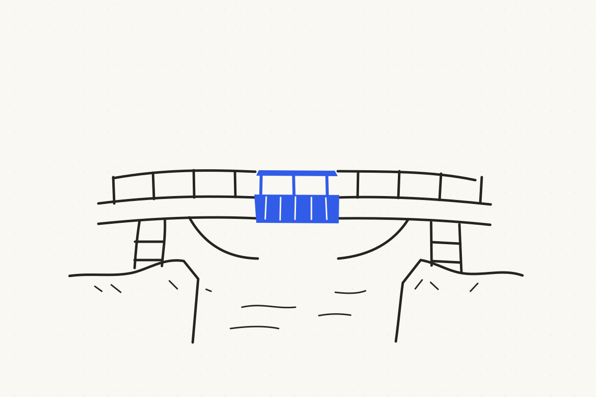
Original Coverish concept illustration · Draft art direction
Systems · Work & teams Download style guide
Repair the missing piece
A spare ink bridge spans two banks. Its missing center is replaced by one blue section.
- The article idea
- Improving a process by fixing the one connection that keeps breaking.
- Why this metaphor
- A small structural repair can restore the entire journey.
- Visual language
- Horizontal composition · Open interiors · Purposeful accent · No text
Explore the styleInk and Accent
An original illustration preview. It demonstrates the concept; the style has not been validated with an image generator.
A starting point for your own cover
Take the idea further.
Article idea: Improving a process by fixing the one connection that keeps breaking.

Cover concept: A spare ink bridge spans two banks. Its missing center is replaced by one blue section.

Visual metaphor: A small structural repair can restore the entire journey.

Suggested style: Ink and Accent (draft v0.1)
The complete style guide is attached below

Adapt this concept to the article. Apply the style guide's visual rules and review the generated result.

---

# Ink and Accent

- ID: ink-and-accent
- Version: 0.1
- Status: draft — no generation validation yet
- Provenance: original proposed art direction
- Evidence: [test plan](EXAMPLES.md)

## Visual character

Sparse editorial pen drawing on clean pale paper. Confident imperfect contours describe an object or small scene. A single flat color patch highlights the idea.

## Invariants

- Dark contour lines with modest natural variation.
- Open interiors and very limited hatching.
- One visual metaphor with no more than three principal elements.
- Accent color has a semantic role, such as the missing piece or selected path.
- Flat drawing without rendered lighting or realistic volume.

## Palette

Default: pale paper #FAF8F2, ink #242522, and cobalt #315CE8. A supplied brand accent may replace cobalt; preserve strong ink/background contrast and one accent family.

## Composition and format

Use one readable scene surrounded by substantial empty space. Favor contours that remain clear in a small preview. Default to wide 16:9, with square composition available by rearranging the scene. Simplify before shrinking.

## Text

No embedded lettering by default. If the article needs a title, leave a quiet region and pass the exact headline to the later typesetting step.

## Subject adaptation

Translate the selected concept into familiar objects and a simple relationship. Preserve line character, open interiors, and color restraint. Do not add generic lightbulbs or robots unless they express the chosen concept.

## Avoid

Heavy crosshatching, crowded diagrams, gradient fills, photorealistic shading, many colored objects, tiny annotations, and ornamental borders.

## Agent procedure

Reduce the concept to one scene; identify the detail that should receive the accent; apply format and title-space preferences; export the brief with the draft label.

## Prompt skeleton

Draw [concept] as a sparse editorial ink illustration. Show [main objects and relationship] with confident slightly imperfect dark contours, open interiors, and minimal hatching on [background]. Use one flat [accent] patch on [meaningful detail]. Compose for [format], keeping [headline region] clear if needed. No lettering, gradients, or rendered 3D shading.

## Review

The metaphor reads without labels; linework is consistent; the accent serves the concept; detail survives thumbnail viewing; empty space is useful.
Keep exploring
View the style →